Mod:Hunt Research Group/heatmap
Sample Jupyter Notebook File
BCHARGE.ipynb link
Some simple background
This page will provide a simple, beginner friendly instructions on how to visualise 2D data (3x3, 4x4, and 5x5 matrices). You are encouraged to conduct your own research before looking at this page, stack overflow is a good starting point. However, if you have tried your best or time is a major issue say no more and read below.
In this tutorial we will be using Python. You should be familiar with Python from your computational labs during your undergraduate degree. The libraries we are going to use are: matplotlib; pandas and seaborn.
There are a number of Python editor but I recommend using Jupyter Notebook. It is free, Windows and Mac friendly. Jupyter Notebook can be installed by downloading Anaconda, a powerful engine that makes scientific programming simpler. Download link the newest version, install and run Jupyter Notebook.
Prior to atuclly using Jupyter Notebook, please ensure you have your data at hand as a .csv file (In excel you can simply save the current spreadsheet as a .csv file, for .txt file I belive there is also a way).
Codes
Navigate to a new folder designated to this project and follow the instructions below:
First type the follwoing command in the first cell:
import pandas as pd

import numpy as np

import seaborn as sns

import matplotlib.pyplot as plt

import csv

import re

%matplotlib inline
These lines make sure we have imported the libraries we are going to use. After typing in these lines simple hit Shift+Enter to execute those lines. You will not see a response, which is normal, now carry on and type these in the second cell:
with open ('Bcharges.csv', "r") as file:
        df = pd.read_csv(file, delimiter = ",")
        df.columns = ((df.columns.str).replace("^ ","")).str.replace(" $","")
        print(df.columns)
This cell correctly formatted .csv file and will let us know all names of the column (Note: Very Important: You must ensure your .csv file is in the same folder as this Jupyter Notebook. Otherwise this will not work!) Normally we do not want the first cell to show anything, so we simply run a command so the name of the first column is not at the same line as the table:
data = pd.read_csv('Bcharges.csv')
data = data.set_index(data['Unnamed: 0']).drop(['Unnamed: 0'],axis=1)
data
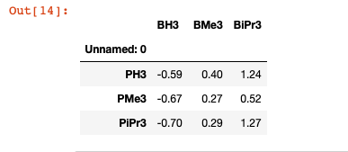
The name of my first column is 'Unnamed: 0' so I simply dropped it with 1 line below. Now you should see something like this:
sns.heatmap(data,annot=True, linewidths=.5,fmt="g", cmap='viridis').set_ylabel("")
ax = plt.axes()
ax.xaxis.set_ticks_position('top')
ax.set_title('Heatmap Representation for B charges', y=1.14, fontsize = 17)
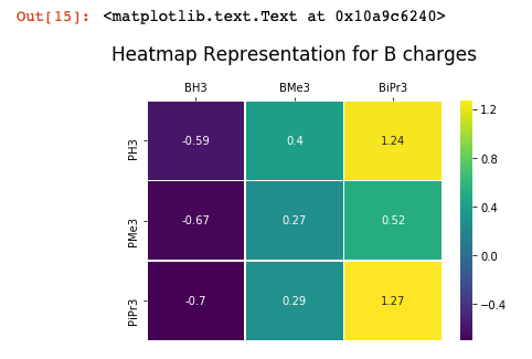
This is a compact code to plot a heatmap. You can use your intuition to play with all the variables in the bracket until you feel comfortable with your plot.
Your final plot should look something like this:
Recommendations
Refer to seaboarn documentations linkand see what else you can add on your graphs!


